Simple DALL·E Prompt Formula for Beginners

Simple DALL·E Starter Kit for Creative Beginners: A Clean, Repeatable Way to Get Better Images
Getting satisfying AI images is less about “talent” and more about giving clear, structured text instructions. A few small choices—subject, style, lighting, camera angle, color palette, and mood—can turn random results into images that look intentional. The goal is to keep your workflow simple: start with a strong baseline, then refine with one focused change at a time. This guide breaks the process into beginner-friendly building blocks, shares quick refinements that don’t feel technical, and includes practice-ready ideas you can reuse for illustrations, social posts, journaling pages, digital stickers, mood boards, and concept art.
What Makes Text Instructions Work (Without Guesswork)
When results feel “off,” it’s usually because the direction is either too vague or too crowded. A clear instruction reads like a tiny creative brief.
- Start with one specific subject: a person, object, animal, place, or scene. “A sleepy orange cat” beats “a cute cat.”
- Add one main style direction: watercolor, ink sketch, pixel art, paper cutout, 3D clay, cinematic photo, or children’s book illustration.
- Include 1–2 scene details that matter: a setting, a prop, weather, or time of day.
- Control mood with lighting and color: soft morning light, neon glow, warm pastel palette, or dramatic shadows.
- Keep it short first: add extra detail only after a baseline result feels close.
If you want a deeper look at how image generation works under the hood (without needing to become technical), OpenAI’s official documentation is a helpful reference: OpenAI — Image generation documentation.
A Beginner-Friendly Formula for Consistent Results
A repeatable structure makes your outputs more predictable and easier to troubleshoot. Think in “slots” you can fill in, rather than reinventing the wheel each time.
- Use a stable order: Subject + Action/pose + Setting + Style + Lighting + Color palette + Composition.
- Pick one “hero” detail: prioritize one standout element (like “gold foil highlights” or “cozy cottage kitchen”) to avoid conflicting directions.
- Add composition cues when needed: close-up, wide shot, centered, rule of thirds, minimal background, negative space.
- If faces or hands look off: shift to illustration styles (ink, watercolor, gouache) or simplify the scene.
- Create variations safely: swap only one element at a time (palette, era, medium, camera angle) so you can tell what changed the result.
Quick Fill-In Template and Example Variations
| Part | What to add | Example |
|---|---|---|
| Subject | Who/what is the focus | A sleepy orange cat |
| Action/pose | What it’s doing | curled up on a window seat |
| Setting | Where it is | rainy city apartment, plants on the sill |
| Style/medium | How it should look | storybook watercolor illustration |
| Lighting | Time and light quality | soft dusk light, gentle shadows |
| Palette | Dominant colors | muted blues and warm oranges |
| Composition | Framing and layout | wide shot, negative space on the right |
Easy Tweaks That Improve Results Fast
Once you have a decent baseline, small, targeted refinements usually outperform big rewrites.
- Clarify focus: “sharp subject, soft background” or “shallow depth of field” helps the main idea read instantly.
- Reduce clutter: request “minimal background” or “simple shapes” if images look busy or noisy.
- Keep style consistent: avoid mixing too many mediums (for example, “oil painting” + “vector logo” + “photorealistic” all at once).
- Steer positively: describe what should appear instead of listing what you don’t want, which can accidentally reinforce unwanted elements.
- Add a specific vibe cue: “1970s print ad aesthetic,” “Kyoto alley at night,” or “Nordic folk art” can make results feel less generic.
Illustration Ideas for Practice (Beginner Set)
Practice works best when each attempt has a single, clear goal. Try one of these mini-assignments and keep your structure consistent.
- Children’s book scene: one small character doing one simple action, soft palette, gentle textures.
- Cozy interior: one room, one main light source, and a few storytelling props (mug, book, blanket).
- Botanical poster: single plant specimen, clean background, labeled style like a vintage scientific plate.
- Food illustration: one dish on a simple plate, top-down view, bright natural light.
- Character concept: full-body turnaround in a consistent style with simple shapes and limited colors.
From Single Images to a Cohesive Set
A cohesive series looks “designed,” even when each image features a different subject. Consistency is mostly about making a few rules and sticking to them.
Digital Download: What’s Included and How to Use It
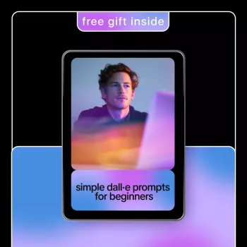
- Simple DALL·E Starter Kit (digital download) ($9.99) includes beginner-friendly examples across multiple illustration looks plus a fill-in template so you can build instructions without overthinking.
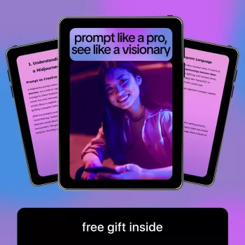
- If you also experiment with other generators, Midjourney text-instruction guide for creators ($9.99) is a helpful companion for keeping your wording clean and your style choices consistent when switching tools.
Common Beginner Mistakes (and Simple Fixes)
For project planning and distribution, it’s also smart to review basic copyright guidance before selling or publishing creative work: U.S. Copyright Office — Copyright registration guidance.
FAQ
How detailed should the text instructions be for beginners?
Start with 1–2 sentences covering the subject, style, and lighting. Add composition or a color palette only if the first results are close but not quite right, and refine by changing one element at a time.
Why do results sometimes look inconsistent even with similar wording?
Small wording shifts can nudge the output in different directions, and there’s also natural variation between generations. A fixed template—same palette, medium, lighting, and framing—helps stabilize a series.
Can the images be used for downloads or small creative projects?
Usually yes, but always review the specific tool’s usage rights and avoid trademarks or celebrity likenesses. Keeping notes on what you generated (and how) and focusing on original concepts makes your projects easier to manage.


Leave a comment